어떤 통계나 결과를 그래프의 형태로 표현하기 위해 분명 관련된 라이브러리가 있을 것 같아 찾아보던 중 MPAndroidChart를 발견했습니다.
사용법도 매우 쉽고 사용할 수 있는 메소드와 속성이 정의가 잘 되어 있어 정리해보려 합니다.
Github 링크에서 볼 수 있듯 많은 차트 형태가 있지만 저는 원형으로 차트를 작성하는 Pie Chart를 구현해 보겠습니다.
GitHub - PhilJay/MPAndroidChart: A powerful 🚀 Android chart view / graph view library, supporting line- bar- pie- radar- bubb
A powerful 🚀 Android chart view / graph view library, supporting line- bar- pie- radar- bubble- and candlestick charts as well as scaling, panning and animations. - GitHub - PhilJay/MPAndroidChart:...
github.com
app: build.grdle
// Pie Chart
implementation 'com.github.PhilJay:MPAndroidChart:v3.1.0'
settings.gradle
pluginManagement {
    repositories {
        ...
        mavenCentral()
        maven { url = 'https://jitpack.io'}
    }
}

dependencyResolutionManagement {
    repositories {
        ...
        maven { url = 'https://jitpack.io'}
    }
}
의존성을 추가하는 gradle 설정이 다들 달라 조금 헤맸습니다.
본인의 스튜디오 설정에 맞게 의존성을 추가해주면 될 것 같습니다.
.xml
<com.github.mikephil.charting.charts.PieChart
    android:id="@+id/pie_chart"
    android:layout_width="300dp"
    android:layout_height="300dp"
    android:layout_marginTop="20dp"
    app:layout_constraintEnd_toEndOf="parent"
    app:layout_constraintStart_toStartOf="parent"
    app:layout_constraintTop_toBottomOf="@+id/frameLayout" />
레이아웃 구성은 매우 간단합니다.
차트를 그리고 싶은 레이아웃에 컴포넌트 하나만 추가하면 끝입니다.
해당 컴포넌트를 찾을 수 없다면 gradle 파일을 다시 확인해 주세요.
Fragment
private fun setBarChart() {
binding.pieChart.setUsePercentValues(true)
// data set
val entries = ArrayList<PieEntry>()
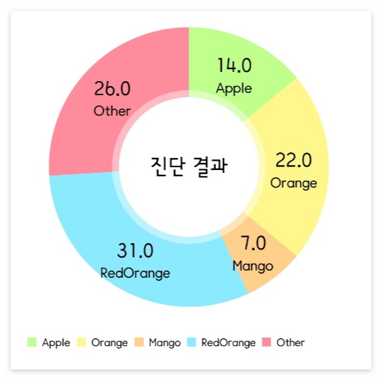
entries.add(PieEntry(14f, "Apple"))
entries.add(PieEntry(22f, "Orange"))
entries.add(PieEntry(7f, "Mango"))
entries.add(PieEntry(31f, "RedOrange"))
entries.add(PieEntry(26f, "Other"))
// add a lot of colors
val colorsItems = ArrayList<Int>()
for (c in ColorTemplate.VORDIPLOM_COLORS) colorsItems.add(c)
for (c in ColorTemplate.JOYFUL_COLORS) colorsItems.add(c)
for (c in COLORFUL_COLORS) colorsItems.add(c)
for (c in ColorTemplate.LIBERTY_COLORS) colorsItems.add(c)
for (c in ColorTemplate.PASTEL_COLORS) colorsItems.add(c)
colorsItems.add(ColorTemplate.getHoloBlue())
val pieDataSet = PieDataSet(entries, "")
pieDataSet.apply {
colors = colorsItems
valueTextColor = Color.BLACK
valueTextSize = 18f
}
val pieData = PieData(pieDataSet)
binding.pieChart.apply {
data = pieData
description.isEnabled = false
isRotationEnabled = false
centerText = "진단 결과"
setEntryLabelColor(Color.BLACK)
setCenterTextSize(20f)
animateY(1400, Easing.EaseInOutQuad)
animate()
}
}차트를 그리는 대략적인 순서는 Entry 객체로 이루어진 배열 생성(데이터셋) → 앞서 만든 데이터셋을 PieDataSet에 추가 → PieDataSet을 PieData에 추가하는 순서로 진행됩니다.
실행결과
차트의 속성 네이밍이 대부분 직관적으로 인지할 수 있었지만 디테일한 수정을 위해 속성을 좀 더 다루어 보겠습니다.
'Android' 카테고리의 다른 글
| [안드로이드] Material DropDown Menu(드롭다운 메뉴) 만들기 (0) | 2023.04.13 |
|---|---|
| [안드로이드] Fragment의 LifeCycle과 동작원리 (1) | 2023.04.11 |
| [안드로이드] 프로젝트 패키지명 변경 (4) | 2023.03.16 |
| [안드로이드] Glide로 이미지 load시 이미지가 흐려지는 경우 해결방법 (1) | 2023.03.13 |
| [안드로이드] 안드로이드 스튜디오 유용한 기능 - 기능별 단축키 지정하기 (0) | 2023.03.04 |


